How To Slice Up Graphics for XHTML and CSS
Original published date: 13, January 2010
In this tutorial, we will learn how to slice up and save graphics to be used as CSS background images in an XHTML page. This tutorial is part of a series. I would advise readers to follow the previous tutorial in this series, Creating a Fancy Web Layout in Gimp 2.6. But, this is not necessarily required, as I will give the background graphics here for those who just want to simply learn how to place graphics into a layout. Once again, this tutorial requires knowledge of Gimp 2.6’s workspace. Let’s get started, shall we?
Slicing and Saving the Graphics
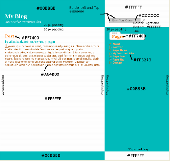
1. If you followed the last tutorial, open our Gimp file “gimp-weblayout.xcf”. What we want to do here, before we get started is put information in the form of labels on top of our layout, specifying colors, widths, margins, etc. This will help us when plugging information into our stylesheet
- Create a New Layer above all of the layers and name it labels
- Select the Background layer and use the Color Picker Tool to select the blue green color. Click the Foreground Colorswatch, note the color code next to the HTML notation section; click Cancel
- Use the Text tool to create text above the Header; type #00BBBB in black
- Duplicate this layer twice and place the #00BBBB text within the Sidebar and Footer. Make sure to move each layer to the top of the layer stack
- You can Merge these three layers down to the Labels layer
- For the purposes of saving time, I created the rest of the labels and saved the resulting file as a .png, shown below. Feel free to right click and download this for reference later
2. Now, we will get into the good part, the slicing, starting with the Header/Footer
- Hide the Labels layer, if you created it
- The first file we will save is the header and footer background. Since these two sections have identical backgrounds, we can use the same file. These will be “faux columns” that will repeat vertically behind our header and footer
- Click the Header layer. Create a Rectangle Selection and make sure the Position is 0. The Size box in the Toolbar should have the values 760 and 1
- Go to the Edit menu and choose Copy Visible– this copies everything visible within our selection
- Create a New file. The width should be 760; height: 1 px
- Anchor the Layer (under Layer > Anchor Layer)
- Save As header-footer_bg.png. This is saved in the “images” folder where our “gimp-weblayout.xcf” file is
3. The next slice is the Content area
- Select the Content layer. Create another Rectangle Selection Position 0, 400 and Size 760 and 1. Copy Visible
- Paste into a New file 760 by 1 px, as before. Save As “content_bg.png”
- For those who are interested in getting up to speed quickly, the two files are below. Right click these (you may have to Zoom in on your browser) and Save the first image as “header-footer_bg.png” and the second as “content_bg.png”
![]()
![]()
4. The next thing we will slice n’ save is our button design behind the “Pages” heading
- We don’t want the actual text to show here as this will be provided by WordPress’s XHTML, so we must hide the Pages text layer by clicking the eye next to it
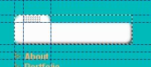
- Now, click the Sidebar layer. Zoom In a little and select the area as shown below. Make the Position’s first box 471, Size 160 by 40 and make sure to select Lock Alpha Channel in the Layers dock. This time, choose Copy
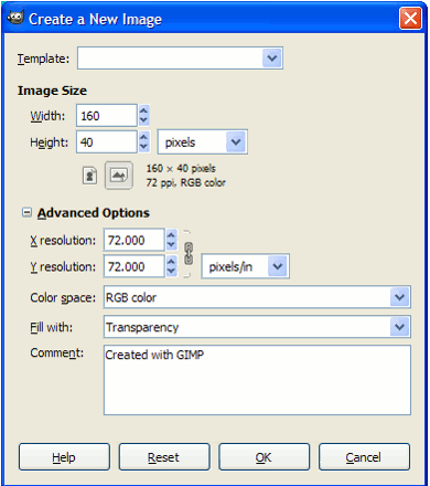
- Create a New file, but make sure to choose Fill With: Transparency under the Advanced Options section- this step is important. The information is shown in the screenshot below. Make sure the width and height are 160 and 40, respectively
- Paste and then Save As “button.png”
5. Now we must slice the small icons to be used as bullets
- Zoom in to 1600
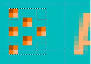
- We will pretty much follow the same instructions as above- Selecting the area around each shape (clicking it’s layer first), Locking the Alpha Channel, Copying, noting the Rectangle’s size, creating a New file at the same size with a transparent background, Pasting and Saving. The three screenshots below show the selections:
- Save the files as “redpixelbullet.png”, “arrowbullet_red.png” and “arrowbullet_gray.png” in the images folder
- On “arrowbullet_red.png” and “arrowbullet_gray.png”, we have to redo the opacity, as Gimp’s Paste method didn’t preserve it. Lower the opacity to 75 and 50 respectively
- Below are these files for you to right-click and download. Rename them if they have different names
![]()
![]()
![]()
1 Comment
Trackbacks and Pingbacks
Trackback URL for this post: https://www.jasong-designs.com/2013/05/31/how-to-slice-up-graphics-for-xhtml-and-css/trackback/
-
[…] Creating a Fancy Website Layout in Gimp 2.6, and How To Slice Up Graphics for XHTML and CSS. […]
-
[…] How To Slice Up Graphics for XHTML and CSS […]
-
[…] in a series. It follows three previous tutorials: Creating a Fancy Website Layout in Gimp 2.6, How To Slice Up Graphics for XHTML and CSS and Converting a Static HTML Site into a WordPress Theme- Part 1. In the last tutorial, we left off […]
hi I have to create a pilocy document which needs to exist in 2 different countries. So I want to have one common document (the bulk of the document) and insert various sections that can vary by country.Can you point me to a simple way to do this please?