How To Slice Up Graphics for XHTML and CSS
Internet Explorer Fixes
12. While browsing Tutorialized.com, I found the just in time article, 9 Most Common IE Bugs and How to Fix Them. Following the suggestions here will allow us to fix the IE7 issues. Instead of putting these CSS hacks into valid code, we will put them in conditional comments
- Setup our conditional comment structure in index.html’s <head> tag. Make sure NOT to leave any spaces within the conditional opening and closing comments. I did so at first and IE7 did not recognize my external stylesheet. Type exactly as below:
-
<!--[if lte IE 7]>
<link rel=stylesheet type="text/css" href="ie_fixes.css" media=screen>
<![endif]-->
just below the </title> closing tag
*Note: A reader below noted that the web page after the Internet Explorer fixes did not render correctly in IE 8. I finally found out why. A quick Google search on IE 8 and standards reveals that Internet Explorer 8 is now standards compliant by default, thus our new conditional comment above targets IE 7 and below, the non standards browsers.
- Now, create a new stylesheet “ie_fixes.css” and Save in the same folder with index.html
- The information from here on is gleaned from the 9 Most Common IE bugs article. Needless to say, if you are working in Windows, you will want to preview in Internet Explorer. First, we will target the centering (or non-centering) issue in IE7. Type the following in “ie_fixes.css”:
-
body { text-align: center; /* centers layout in IE */ } #wrapper { text-align: left; /* aligns text left in the wrapper div- everything else */ } - d. Now, we can fix the inner header divs and the content and sidebar divs. Type the following:
-
#left { width: 469px; /* IE excludes padding from the total width, instead placing it outside the width */ } #sidebar-2 { /* leave this width as is */ } #content { width: 469px; } #sidebar { width: 271px; } - Finally, handle the footer in IE:
-
#footer {
width: 740px;
}
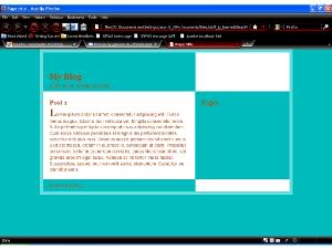
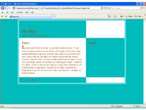
And finally, we are finished with this section (with two screenshots below- our web page in Firefox 3 and IE7). But wait! You may be asking, “What about our sidebar lists and embellishments, Our post and blog title colors and time and date information?” These details and their CSS counterparts will be discussed in the next tutorial.
Want to know more about GIMP, HTML and CSS? Check out JGPWS Tutorials.
Resources
- Creating a Fancy Web Layout in Gimp 2.6– The first tutorial in this series.
- www.chami.com/htmlkit/ HTML-Kit- A great text editor with plugin support.
- www.tutorialized.com Tutorialized.com- A vast collection of tutorials.
- net.tutsplus.com/tutorials/html-css-techniques/9-most-common-ie-bugs-and-how-to-fix-them/ 9 Most Common IE Bugs and How to Fix Them- pretty self explanatory.
- msdn.microsoft.com/en-us/library/ms537512(VS.85).aspx Information directly from the Microsoft Developer Network on how to use conditional comments in your HTML pages.
Comments From Previous Readers
Here are some comments from previous readers of the Squidoo lens that are pertinent to this tutorial.
From Antony Wright:
Hi. Ive followed this tutorial (which is great by the way), and have one small issue. The heading “Pages” which should go to the top of the tool bar – doesn’t. Ive compared my code with the code give and I cant find anything that doesn’t match. However it stubbonly remain at the bottom of the contents section. The only thing I cna think of that is causing it is maybe its because Im using IE 8? Any thoughts?
My response:
Hello Antony, I’m not quite sure why Internet Explorer 8 would not recognize the IE specific fixes, as it targets IE 6 and up. However, I also don’t have IE 8, so they may have changed the layout specifications. One first thing to try is just to make sure in the conditional comment that there is a space between the IE and 6 part
Another thing to try is a new conditional comment (replace “if gte IE 6” with “if IE 8”) and a new “ie8_fixes” stylesheet and try resetting the padding to 429px on the #left and #content divs. But, since I don’t have a copy of IE 8, this is my best guess.
…
Antony, let me know how this turns out and if these solutions don’t work, I’ll figure something else out.
1 Comment
Trackbacks and Pingbacks
Trackback URL for this post: https://www.jasong-designs.com/2013/05/31/how-to-slice-up-graphics-for-xhtml-and-css/trackback/
-
[…] Creating a Fancy Website Layout in Gimp 2.6, and How To Slice Up Graphics for XHTML and CSS. […]
-
[…] How To Slice Up Graphics for XHTML and CSS […]
-
[…] in a series. It follows three previous tutorials: Creating a Fancy Website Layout in Gimp 2.6, How To Slice Up Graphics for XHTML and CSS and Converting a Static HTML Site into a WordPress Theme- Part 1. In the last tutorial, we left off […]


hi I have to create a pilocy document which needs to exist in 2 different countries. So I want to have one common document (the bulk of the document) and insert various sections that can vary by country.Can you point me to a simple way to do this please?