Creating a Fancy Website Layout in Gimp 2.6
Original publish date: 8 January, 2010
I wrote this tutorial to state that you don’t have to use Photoshop to create a graphically rich web layout. Photoshop obviously is a great, multi-purpose design tool, but you can create just as good designs with the free Gimp as well. The main purpose of the tutorial is to teach it’s readers how to create a nice looking, WordPress specific, web layout in Gimp. This will be followed by two more tutorials: “How to slice up graphics for XHTML and CSS” and “Converting a static HTML site into a WordPress theme.” This is not an original idea, but one I wanted to try my hand at writing a tutorial for. Proper credits will be given for sources I used and which inspired me.
We will create a 2 column website layout specifically made with WordPress in mind. It will feature custom graphics and an example of a search bar. This tutorial requires basic knowledge of Gimp 2.6’s workspace.
Getting Started
1. Open a New file, Image Width: 760, height: 720. Save As gimp-weblayout.xcf in a New Folder named “blue-green-blast”
2. Use the Bucket Fill Tool to fill the background with the color: 00BBBB (Click the foreground color swatch and change the color)
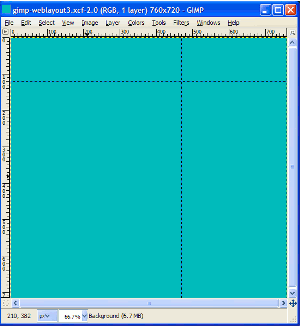
3. Setting up our guides
- Drag a guide to approximately 120 pixels from the top. This will be the height of the header
- The second guide will be placed for our sidebar area. We will place this guide according to the divine proportion, to make our web layout visually pleasing. To do this, we must use some math. We divide our total width by appx. 1.618 to get our content area width, then subtract our content width from the total width to get the sidebar width. 760 / 1.62 = 469px (content). 760 – 469 = 291
- Place the second guide about 470 pixels in from the left. The screenshot below shows how this looks:

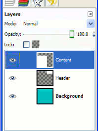
4. Create a new layer and name it Header
- Using the Rectangle Select tool, select the header from the 470 px guide to the right edge
- Under Size in the Toolbox bar, make sure the number in the first (width) box is 291 and in the second box, 120
- Fill with white (FFFFFF) and Ctrl+Shift+A to Select None
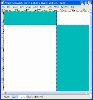
5. Create another new layer and name it Content
- Select the lower left large area bounded by the header guide and the sidebar guide
- In the Toolbox, make the Position 0 and 120, and make the Size 469 and 600
- Fill with white. The two screenshots below show the look of the web page so far and the layer structure
6. Create another layer named Footer above the Content layer
- Drag a guide 40 pixels above the bottom of the page
- Use the Rectangle Select tool to select from the guide just placed to the bottom. In the toolbox, make the Position: 0 and 680, and the Size: 760 and 40
- Fill with color 00BBBB
- Create one more Rectangle, Position: 469 and 680, and Size: 291 and 40 and fill with white. A screenshot is provided below:
Trackbacks and Pingbacks
Trackback URL for this post: https://www.jasong-designs.com/2013/06/23/creating-a-fancy-website-layout-in-gimp-2-6/trackback/


[…] is part of a series. I would advise readers to follow the previous tutorial in this series, Creating a Fancy Web Layout in Gimp 2.6. But, this is not necessarily required, as I will give the background graphics here for those who […]
[…] Creating a Fancy Website Layout in Gimp 2.6 | Jason G. Designs New Look Preview […]