Creating a Fancy Website Layout in Gimp 2.6
Sidebar
7. Create a new layer named Sidebar
- Drag new guides to approximately 490 pixels in from the left and 540 pixels in from the left, 140 pixels from the top and 150 pixels from the top
- Use the Rectangle Select tool to create a rectangle with a size of 160 px by 30 px starting from the 150/490 pixel guide intersection
- Use Rounded Rectangle under the Select menu and give a radius of 40
- Fill this with white then Select None
- Now, create a new Rectangle from the 140 pixel guide, Size 50 by 40; give this one the Rounded Rectangle at 40 as well and Fill with white
- While this new rounded rectangle is still selected, use the Paintbrush tool to paint over inconsistencies on the left side. See screenshot below for the look:
 8. Now, we are going to give the sidebar shape a three dimensional look. We will do this with a bump map
- Select the shape with the Fuzzy Select tool and create a new layer named Sidebar bumpmap
- Fill shape with white then Select None and give it a Gaussian Blur of 5.0 px
- Move this layer below the Sidebar layer
- Then, go to Filters > Map > Bump Map. Under the Bump Map drop down box, select the Sidebar bumpmap layer
- After this is done, hide the Sidebar bumpmap layer. Now check out our side title bar
 9. Create a new layer called Sidebar copy
- In this layer, use the Text tool to create the word “Pages”. Click color to change the color to FF7400 and change the font to Georgia Bold. A comparable font in (Ubuntu) Linux would be Nimbus Roman No9 L.
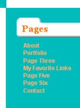
- Then, type the text shown in the screenshot below (in the popup Gimp Text Editor add return spaces after each word). Give it a color of FFB273, font of Arial Bold (or Nimbus Sans L for Linux); adjust the line spacing to 1.3. (This gives an approximation of how the Pages section will look, as this will actually be adjusted via CSS)
10. The next step is the sidebar title details
- Zoom in close (1600 preferably) on the sidebar title design, as we will be creating pixel art in the form of dents and bumps
- The first part will be pixel bumps on the sidebar title design. Create a new layer; no need to name it
- Make the foreground color black (000000) and use the Pencil tool with Brush Circle(01). Click above and to the right of where the two guides meet (above the “Pages” text). Click once more directly above and right of the first pixel
- Now, make the foreground color a dark gray (666666). Click below the upper right square
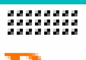
- Make the foreground color a light gray (CCCCCC). Click above the lower left square. This should form a box shape. Create a grid of these three by eight. The two screenshots below show one pixel bump and all of them:
 Next, lower the opacity on this layer to reduce the harshness. I lowered it to 40
- Finally, move this layer down until it is just above the Sidebar layer and go to Layer menu and Merge Down
11. Now we are going to create pixel dents next to our page list items. In our CSS, these will replace bullets on the list. In addition we will add 3D arrows to represent WordPress child pages. Rather than be grayscale, our pixel dents will get colorful
- Zoom in to 1600 again. Create another new layer above Sidebar copy and name it Bullet
- At the guide to the left of our copy, aligned with the “About” text, use the Rectangular Select tool to create a box 12 px by 12 px
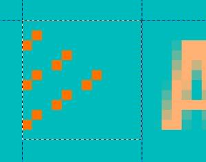
- Make the foreground color FF7400. Using the Pencil tool at 1 px again, draw the pixels as shown in the screenshot below:
 Make the foreground color FFB273. With the Pencil tool, click the lower right pixel in each box
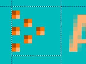
- Now, make the foreground color A64B00. Click the upper left pixel in each box. Check out the screenshot below to see it completed:
 Duplicate (click Duplicate in the Layers dialog) this layer 4 times and arrange as shown in the screenshot below (you can align approximately; hold the Control key as your moving each duplicate). To move each new layer select Move the active layer in Toolbox’s Move tool. Screenshot is below:
 *Thanks goes to this Tutorio.com tutorial for this method of spicing up your website.
Trackbacks and Pingbacks
Trackback URL for this post: https://www.jasong-designs.com/2013/06/23/creating-a-fancy-website-layout-in-gimp-2-6/trackback/


[…] is part of a series. I would advise readers to follow the previous tutorial in this series, Creating a Fancy Web Layout in Gimp 2.6. But, this is not necessarily required, as I will give the background graphics here for those who […]
[…] Creating a Fancy Website Layout in Gimp 2.6 | Jason G. Designs New Look Preview […]