Creating a Fancy Website Layout in Gimp 2.6
Sidebar (continued)
12. Our next items will be 3D arrows to represent child pages in our WP theme idea
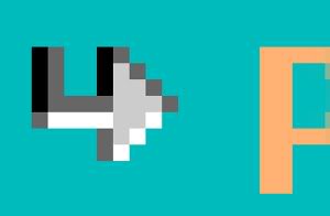
- Zoom in to 1600. Create a new layer named Arrowbullet. In this layer, create the arrow pixel shape as shown in the screenshot below and draw this next to the “Page Three” text. Use our previous colors and white for the color scheme
 Lower the opacity to 75 to make it more subtle
- Duplicate and place beside the “Page Five” text
- Now we will create the same 3D arrow in grayscale for our grandchild pages. For this, we will create a new layer and name it Arrowbullet gray. Once again, create the pixel art shown in the screenshot below using the colors from our pixel bumps earlier and white. Draw to the left of the “Page Six” text
Header and Content
13. In the Header, we will represent simple white text for the blog title. This will be replicated with CSS later. Type “My Blog” with the Text tool as the blog title with font size 24 px. Below the “My Blog” title, click to reactivate the Text tool on a new line and type “Just Another WordPress Blog” with font: Georgia italic and size: 12px. Here, you don’t have to worry about the spacing, as this will be handled by CSS in my next tutorial
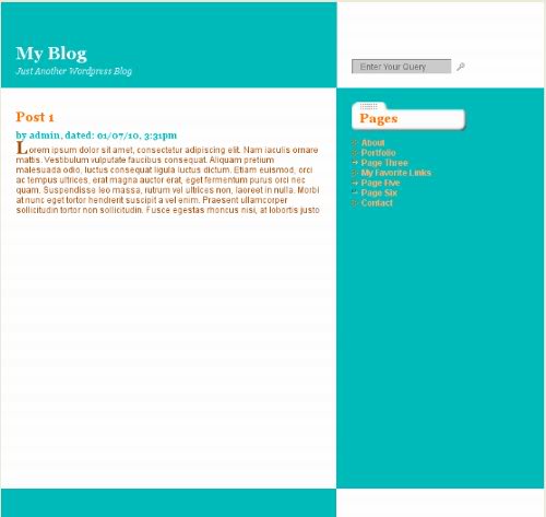
14. Now we will enter a “dummy” post below as our index page’s content. Here, we will also show a date, time stamp and author information
- Type “Post 1” in the content area above the Content layer. Make the color FF7400, size 18px and font Georgia Bold
- The area below will be where we put our date and author info. Type “by admin, dated: 01/07/10, 3:31pm”. Color: 00BBBB, font Georgia Bold, size 12px
- Next, is our post text. We will use Lorem Ipsum text, which can be found at lipsum.com. At the bottom of the page is where you can generate Lorem Ipsum dummy text. We will need one paragraph for our example. Click Generate Lorem Ipsum. Highlight and Copy the text
- Use the text tool to click and drag a text box underneath the author and date text. Paste the Lorem Ipsum copy into the GIMP Text Editor popup. Font: Arial, Color: A64B00
- Now, we must simulate a drop cap, a larger first letter in our paragraph. For this, erase the first L in our Lorem Ipsum copy above and put about six spaces before the o
- Create a new text line and type a capital L into the Gimp Text Editor. Font: Georgia Bold, Color: A64B00 Move into place, just next to the dummy paragraph as shown below:
Search Box
15. Finally, we want to put a search box in the upper right corner. In our theme, this will be a widget ready second sidebar next to the blog title in our header
- Here we will create a 3D look that will actually be created in our CSS with borders. We will also add an icon and a background color
- Create a layer named Search
- Create a Rectangle at Position: 491 and 80, and Size: 140 and 20
- Fill with color CCCCCC
- With the layer Selected, draw a 1 pixel color 666666 line across the top with the Pencil tool, holding the Control key; Also, draw a 1 pixel same color line along the left side
- Do the same for the bottom and right sides with the color EEEEEE
- In this box, type the words “Enter Your Query” with the color 666666
16. The next part involves placing an icon to the right of our searchbox. We will use a free Blog Icon Pack provided by Graphic Push: www.graphicpush.com/index.php?s=icons. These simple but elegant graphics fit in well with our searchbox design
- Download and unzip (extract) these files. Your operating system will have information on how to do this. Move the “graphicpush_blogicons_free” unzipped folder to a convenient location such as a general Documents folder
- From this folder, select “mag_glass.gif” and “speech_bubble.gif”; these are the two files we will use in our blog design. Hold Control to select both, Copy. In the folder where our file is stored (blue-green-blast), create a folder named “images”. Paste the two icons here
- Open the mag_glass.gif file in Gimp. Copy this file and in your web layout file, Create one more layer, name it Search icon and Paste into this layer. Go to the Layer menu and choose Anchor Layer
- Move the icon next to the search box as shown below (you may need to Zoom In):
Finished Design
17. The final website comp is below. Note that we only show the minimum of information here as many of the same concepts will be repeated in our theme
 In the first tutorial in this series, we learned how to create graphic representations of the header, footer, content area and sidebar. In addition, we covered drawing custom pixel art and bringing icons into our design. In the next tutorial, we will slice up the design to use in XHTML/CSS.
A more updated version of all four tutorials in this series is available on our update page.
Next tutorial: How To Slice Up Graphics for XHTML and CSS.
See more GIMP and HTML/CSS tutorials at JGPWS Tutorials.
Resources
- colorschemedesigner.com/– I wanted to mention about the source I used to get this design’s color scheme. It is called the Color Scheme Designer. I found this link while browsing the WordPress Codex. This tool is nothing short of awesome! While on the page, I plugged in the main color of my design and specified complement. It found the complementary color and a host of related tints and shades. Definitely, check it out if you are looking for an easy way to generate a color scheme for your site.
- www.smashingmagazine.com/2008/05/29/applying-divine-proportion-to-web-design/– Smashing Magazine’s article “Applying Divine Proportion To Your Web Designs”
- www.tutorio.com/tutorial/popular-pixel-detailing-effects/– Pixel Detailing Tutorial
- www.lipsum.com– Lorem Ipsum text generator
- www.graphicpush.com/index.php?s=icons– Beautiful icons for your website or blog, provided by Graphic Push
Trackbacks and Pingbacks
Trackback URL for this post: https://www.jasong-designs.com/2013/06/23/creating-a-fancy-website-layout-in-gimp-2-6/trackback/


[…] is part of a series. I would advise readers to follow the previous tutorial in this series, Creating a Fancy Web Layout in Gimp 2.6. But, this is not necessarily required, as I will give the background graphics here for those who […]
[…] Creating a Fancy Website Layout in Gimp 2.6 | Jason G. Designs New Look Preview […]