Creating Ripped Fabric in GIMP 2.6
Original Publish Date: 8 November, 2009
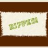
In this tutorial, we will create photo-realistic ripped fabric. This can be a great effect for a fashion or interior design related website or for any other purpose. I used this effect as part of the logo header for JGD’s Tees. This tutorial requires knowledge of GIMP 2.6’s interface.
*Zazzle has updated the look and feel for shopkeepers’ stores. Even though they allow mastheads at the top for logos, I haven’t decided whether or not to keep the original masthead referenced here.
Creating our basic fabric shape
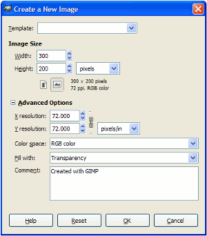
- For this tutorial, we will create a New file at 72 dpi, 300 by 200 pixels, transparent background. Name the file or Save As with a descriptive title
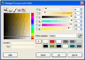
- We next click the foreground color swatch and change the color to R: 251, G: 245, B: 225. It may be a good idea to add the color to the swatch list by clicking the right pointing arrow next to the swatches
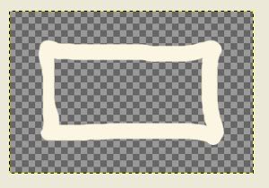
- Then, we select the Paintbrush icon in the Toolbox. In the dialog that appears below, we change the brush size to 19 pixels (circle (19)). We will then draw a rough rectangle shape as shown below
- We now use the Bucket Fill Tool to fill in the center and paint over the small gaps with the Paintbrush tool again
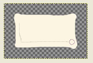
- Next, we use the Eraser Tool (with the same brush settings) to “pinch” the corners. The look we are going after is shown below
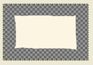
Apply filters to our image
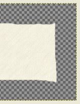
- To get a more textured look, we will apply three filters. First, we Apply Canvas (Filters > Artistic > Apply Canvas…) with a depth of 1
- For the next step, we will need to temporarily create a New Layer. On the background layer, we use the Fuzzy Select Tool to select the area around the shape and Invert (Ctrl+I/Cmmd+I) the selection. Click the New Layer in the Layers, Channels, Paths… dialog and Bucket Fill with our saved color R: 251, G: 245, B: 225. We now apply the RGB Noise filter at it’s default settings. We must make sure to uncheck Independent RGB
- The next filter is the Motion Blur (Filters > Blur > Motion Blur). We will set this to a Length of 10 and an Angle of 135. These aren’t set in stone, so you can experiment here if you’d like. Next, we can lower the opacity on the top layer so the canvas layer can show through. I chose 60 percent. Finally for this part, we Merge Down the New Layer (Layer > Merge Down)
Creating the torn edges
- Next, we must erase the edges first with a hard edged circle brush. For this, I used the Circle (09) brush in the Eraser Tool dialog
- After, we use the Eraser Tool to further roughen the edges. The Galaxy, Small brush works well here. We need to further erase the edges as shown in the left side of our image below
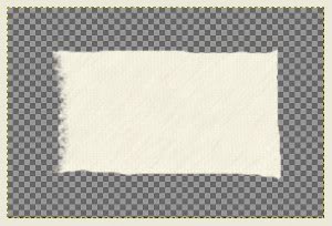
- Now, we create the illusion of ripped edges via the Motion Blur filter. At first we select an area with the Free Select Tool (lasso icon in the Toolbar). The next step is to sharpen the selected area to create more contrast. For this we use the Unsharp Mask filter with its default settings
- The Motion Blur filter is what will provide the ripped look. Under the Motion Blur filter dialog, we apply the filter with a length of 3 and an angle for the lower left corner of 135. The idea is to apply the Unsharp Mask then Motion Blur with varying angles to make the corners look torn in different directions. The lower left corner is shown in this screenshot

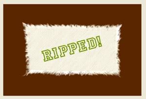
- I used a Motion Blur angle of 0 at the direct right and left sides, 135 for the upper right and lower left corners, 90 for the direct top and bottom and 45 for the upper left and lower right corners. However, you may experiment here greatly to achieve a different effect. My final image is shown below with a background color and text
See more digital imaging tutorials at JGPWS Tutorials.