Jason G Designs- New Menu Look for Tablets

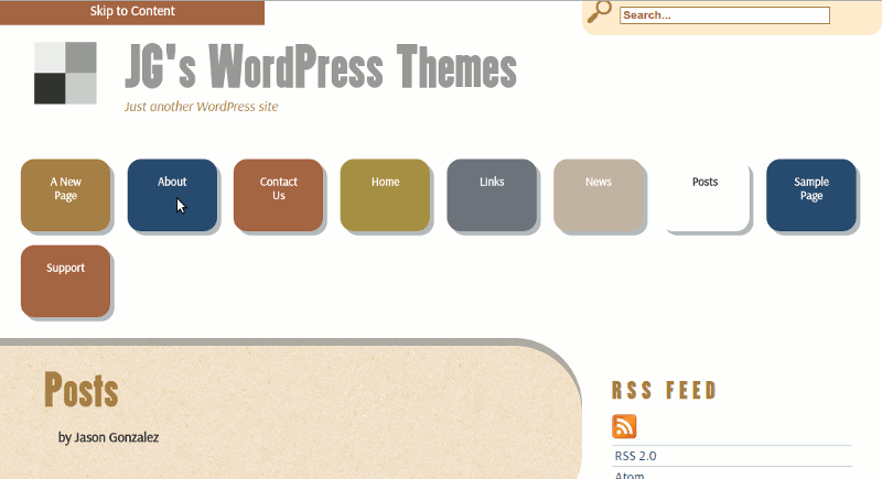
Jason G. Designs unveils a new navigation menu style on tablet computers. I’m now using large, finger friendly buttons aligned across the top of the header. Large buttons will eliminate the possibility of clicking the wrong link. Since the buttons are against the header’s white background, a box shadow is added for emphasis. Check out the new look below!
On the back end (in the code), the navigation menu style for mobile was moved over to an already existing style sheet that is only loaded on mobile phones and tablets. The tablet design actually uses the same menu style as the mobile design. Meanwhile, the background shadow was already provided in the desktop (and previously tablet) tabbed design. Desktop users will still see the regular tabbed interface.
