New Layout Option for JGD-BizElite

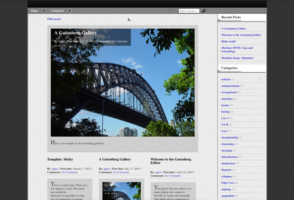
Remember in a post a while back when I announced version 1.3 I mentioned planning more “magazine” features for this theme? Well, the new Featured Articles layout is the result.
Although I did not go with Masonry, as promised, this design in my opinion works better for a magazine style blog. It places the blog’s latest entry as prominent on each page of posts.
On the first page only, the three following posts are presented side-by-side with a unique style. Subsequent posts span full width. With this layout, excerpts are displayed instead of full content.
